This year is on course to be one of the least deadly in recent history for New Zealand
2020 has been an interesting year
COVID-19 and the related lockdowns have put a huge strain financially and mentally on many. However, flying under the radar is a little-acknowledged fact: fewer New Zealanders are dying.
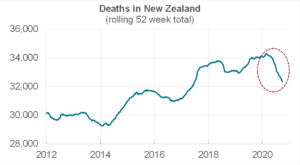
This chart shows the rolling annual number of deaths in New Zealand since 2012. Looking at a rolling annual figure is critical because it removes seasonality (many more people tend to die in the winter months).
As of 27 September 2020, fewer people had died over the preceding year than at any time since July 2017. If we stabilise at these levels, 2020 will see almost 2,000 fewer Kiwis die than would ordinarily have been expected.
Growth and rates
This is even more interesting when we consider that New Zealand’s population has been growing.
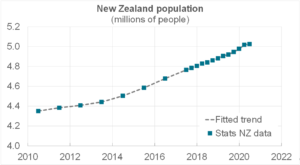
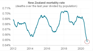
Thus, if we consider the rate of deaths per capita, the picture looks even clearer. The next chart shows that the mortality rate is at its lowest for as far back as we have collected data.
Analysis
We obviously do not know for sure why fewer people are dying but a plausible hypothesis is that lockdown has led to fewer respiratory diseases, such as influenza and the common cold, circulating in the community.
Looking at the weekly data, we can see the effect of a much lighter flu season this year. The typical peak in deaths seen in the winter months is almost non-existent. (The bad 2017 flu season is also prominent.)

Along the same lines, there may have been a general improvement in health practices given the prominence of COVID-19 in the media. For example, greater numbers of people getting flu vaccinations.
(Another hypothesis is that there have been fewer car accidents. Whilst true, this is not a big driver of the reduction in deaths: as of 12 October, the 2020 road toll is only 20 lower than at the same time last year.)
Seasonality
Another way to look at the data is by overlaying each year. The following chart shows the weekly deaths for the past nine years in grey (darker lines for more recent years), the average, and how 2020 is tracking.
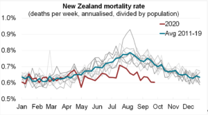
The trend of higher deaths in winter is again evident.
The mortality rate in 2020, which began in line with the average, has been relatively stable over the year, with no notable rise in the winter months.
(Also evident is the spike in deaths in February 2011 when the Canterbury earthquake struck.)
Analysis by age
We can dig into the data by breaking it down by age group. Note that the vertical axis differs greatly across the following charts.
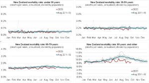
These charts make several points. First, the mortality rate is significantly higher at the older age groups. Note, for example, the average mortality rate in the last chart runs between 8% and 12%, whereas the average mortality rate in the first chart is around 0.05%.
Second, the winter season most heavily impacts our oldest. There is very little change throughout the year in the first charts, but the final chart shows an obvious rise in the winter months.
Finally, the mortality rate in 2020 has been the most different for the older ages. The younger age groups are seeing a mortality rate around the same level as previous years. However, for the over 80 year olds in particular, there has been a distinctly lower mortality rate in 2020.
Conclusion
New Zealand’s mortality rate has been trending downwards for decades. By and large, this has come from improvements in healthcare. Even so, it is evident that lockdowns, social distancing, and improved hygiene practices (e.g. hand-washing and facial coverings) appear to be having an observable effect on mortality.
Authors
Data sources:
- https://www.stats.govt.nz/information-releases/national-population-estimates-at-30-june-2020
- https://www.stats.govt.nz/experimental/covid-19-data-portal
- https://www.transport.govt.nz/mot-resources/road-safety-resources/road-deaths/
- https://www.health.govt.nz/publication/historical-mortality
Download:
This Topix is available as a PDF, click here to download a copy.
