Executive Summary
Introduction and contents
We are pleased to present our report into the KiwiSaver market as it stands in 2022.
Our report begins with an assessment of the KiwiSaver Universe. In this section, we look at the overall statistics of the market and draw conclusions on the direction KiwiSaver as a whole is taking. We then delve into Assets and Membership in more detail, uncovering the largest providers and those which are growing the fastest.
In our section on Fees and Expenses, we examine costs within the system. Next, Performance is examined (on an after-fee basis, since this is the result that is most important to members). Finally, we analyse Competitiveness. Is KiwiSaver an oligopoly or is it relatively competitive?
In the appendices, we include individual KiwiSaver Provider Profiles and further information on Investment Returns and Asset Allocation.
Key conclusions
The KiwiSaver market underwent dramatic change this year. The reallocation of default members saw several providers make significant moves up or down the league tables. Member engagement appears to be improving too, with the number of default members falling at the fastest pace on record.
The following table summarises key statistics of the system:
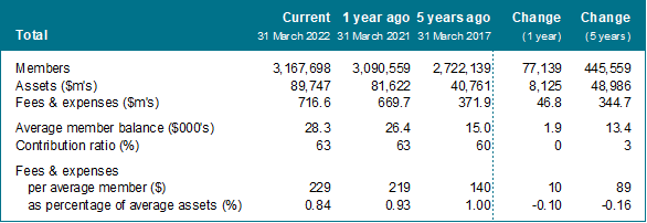
KiwiSaver membership has reached 3.17 million, up about 450,000 from five years ago. Over the same period assets have more than doubled from $40.8 billion to $89.8 billion. While fees and expenses have also increased – $229 per member last year, compared to $140 in 2017 – the average expense rate has fallen 0.16 percentage points to 0.84%. More than half of this reduction came in the last year alone. The average member balance is $28,300, up from $15,000 five years ago. However, demographic studies have shown that big disparities exist between males and females.
Turning to the analysis in the body of this report, we see that the KiwiSaver market remains skewed with just three companies (ANZ, ASB and Westpac) accounting for half of all members. However, several smaller providers have shown that they are able to carve out success stories by focusing on particular niches, be it socially responsible investing, lower fees, member engagement and advice, or strong investment performance. Overall, competitiveness measures continue to improve.
Finally, corporate activity abounds. The Aurora KiwiSaver Scheme launched this year, while the Aon KiwiSaver Scheme was purchased by Fisher Funds. Additionally, after balance date, Fisher Funds announced the purchase of Kiwi Wealth and the Kernel Wealth KiwiSaver Scheme launched.
Authors
For further information, please contact:
| Ben Trollip, FNZSA, FIAA +64-9-300-7315 Ben.Trollip@mjw.co.nz |
Tyler Bond +64-9-300-7156 Tyler.Bond@mjw.co.nz |
The authors wish to acknowledge the work of David Chaplin, of Investment News NZ, who has for many years maintained a database on the KiwiSaver marketplace. This was instrumental in backfilling prior years for this analysis.
Use of this report
The contents of this document may be reproduced, provided Melville Jessup Weaver is acknowledged as the source.
Melville Jessup Weaver has taken every care in preparing this report. However, we are not able to guarantee the accuracy of the information contained within and strongly recommend that appropriate professional advice be obtained before any investment activity is undertaken.
Data has been sourced from KiwiSaver providers’ annual reports, financial statements, and other public sources. Investment News NZ’s database has been used for historical figures. Some figures have been rounded. Data has been aggregated at the provider level and in some cases does not match industry statistics. However, the differences are not significant. While quality control checks have been performed, Melville Jessup Weaver is unable to certify the accuracy of the analysis presented in this report. Melville Jessup Weaver is not liable for any action taken as a result of this report.
This document may be updated when information is made available after publication. For the latest version, please visit the library section of our website.
About Melville Jessup Weaver
Melville Jessup Weaver is a New Zealand firm of consulting actuaries. The areas in which we provide advice include investments, superannuation, employee benefits, life insurance, general insurance, health insurance, and accident insurance. The firm, established in 1992, has offices in Auckland and Wellington.
The firm is an alliance partner of WTW, a leading global professional services company that helps organisations improve performance through effective people, risk, and financial management.
Our investment consulting services include:
- Establishing robust investment governance structures.
- Setting investment objectives and determining long-term investment strategies.
- Providing quantitative and qualitative analysis of investment performance.
- Performance monitoring against investment objectives and competitors.
- Investment manager research and selection.
As independent advisors, we consult with institutional investors, helping them achieve superior investment results, manage risk, and demonstrate value for money for their clients.
Further information can be found on our website: https://mjw.co.nz/
KiwiSaver Universe
Assets
We begin with analysis of the entire KiwiSaver universe. This “top-down” section looks at the KiwiSaver system as a whole and the trends over time. Our first chart shows the total assets under management as at 31 March in each of the last 15 years.
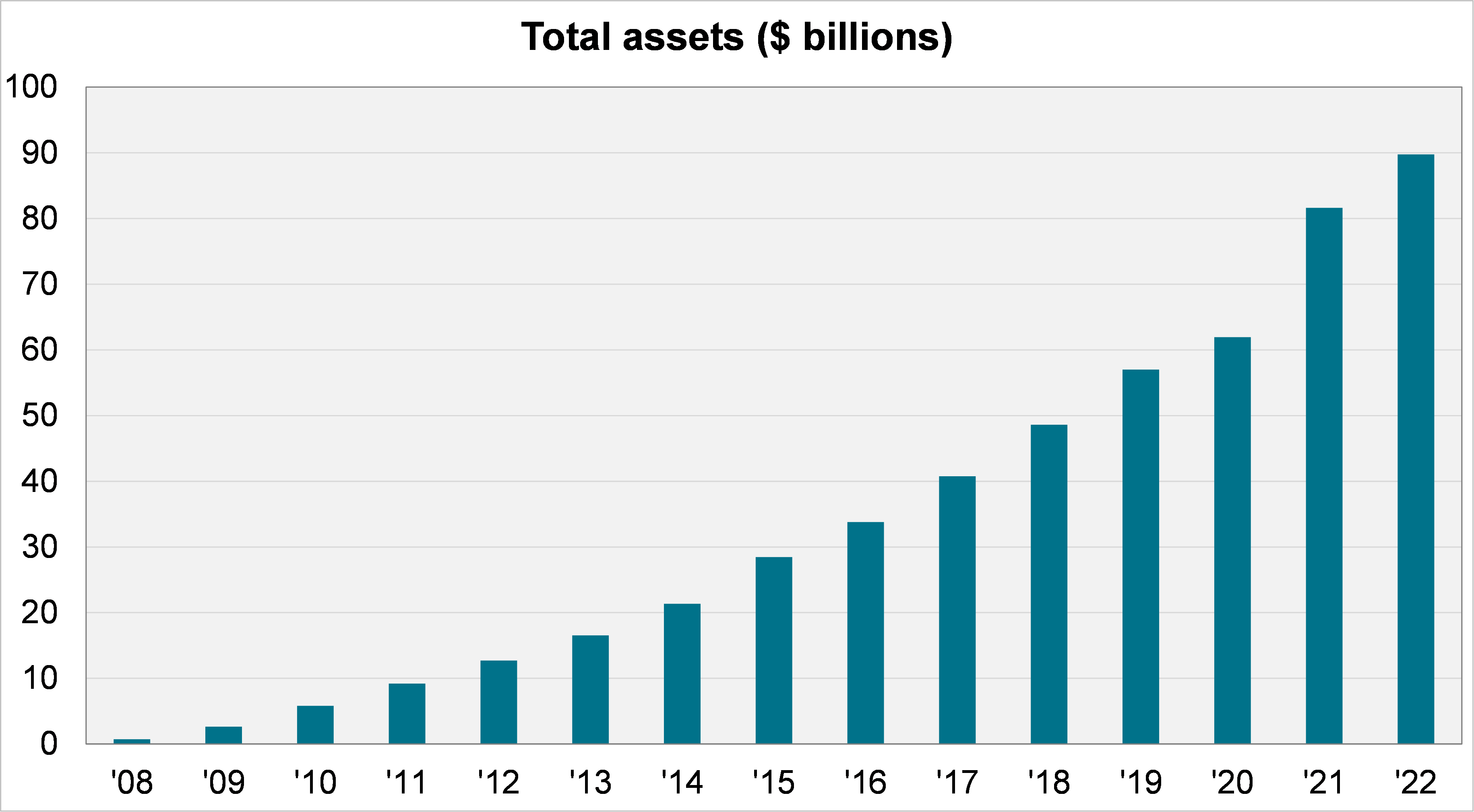
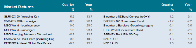
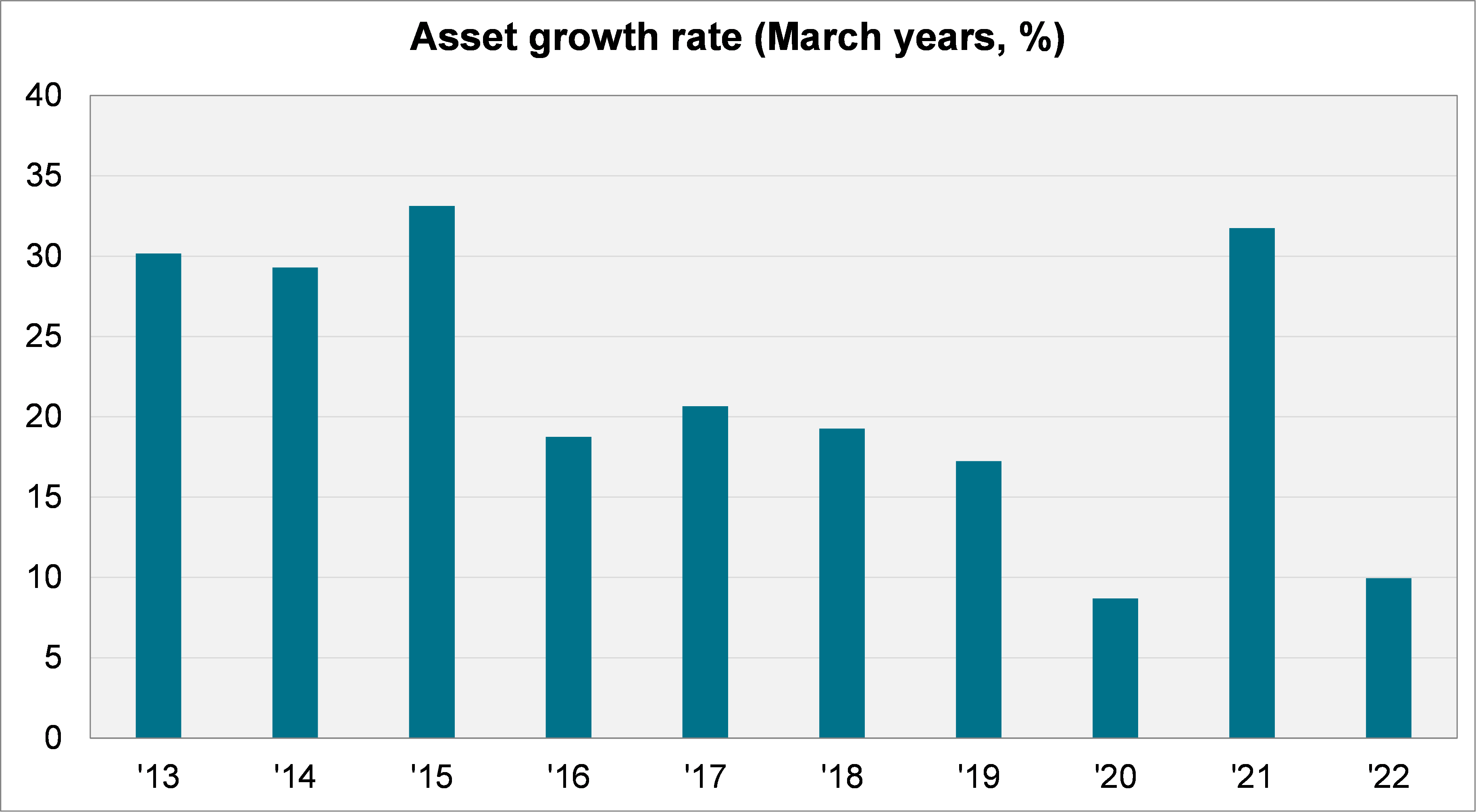
Assets in KiwiSaver have grown to about $90 billion as at 31 March 2022. While a lower rate of growth (10%) compared with last year’s (32%), this is an impressive result given the lower returns from financial markets over the period: the average balanced fund returned about 2% before tax in the year to March (see Appendix B).
In the following chart, we show the rate of growth in recent years in percentage terms.
Members
The following chart shows members in KiwiSaver (left hand side) and how this translates as a proportion of the New Zealand population (right hand side).
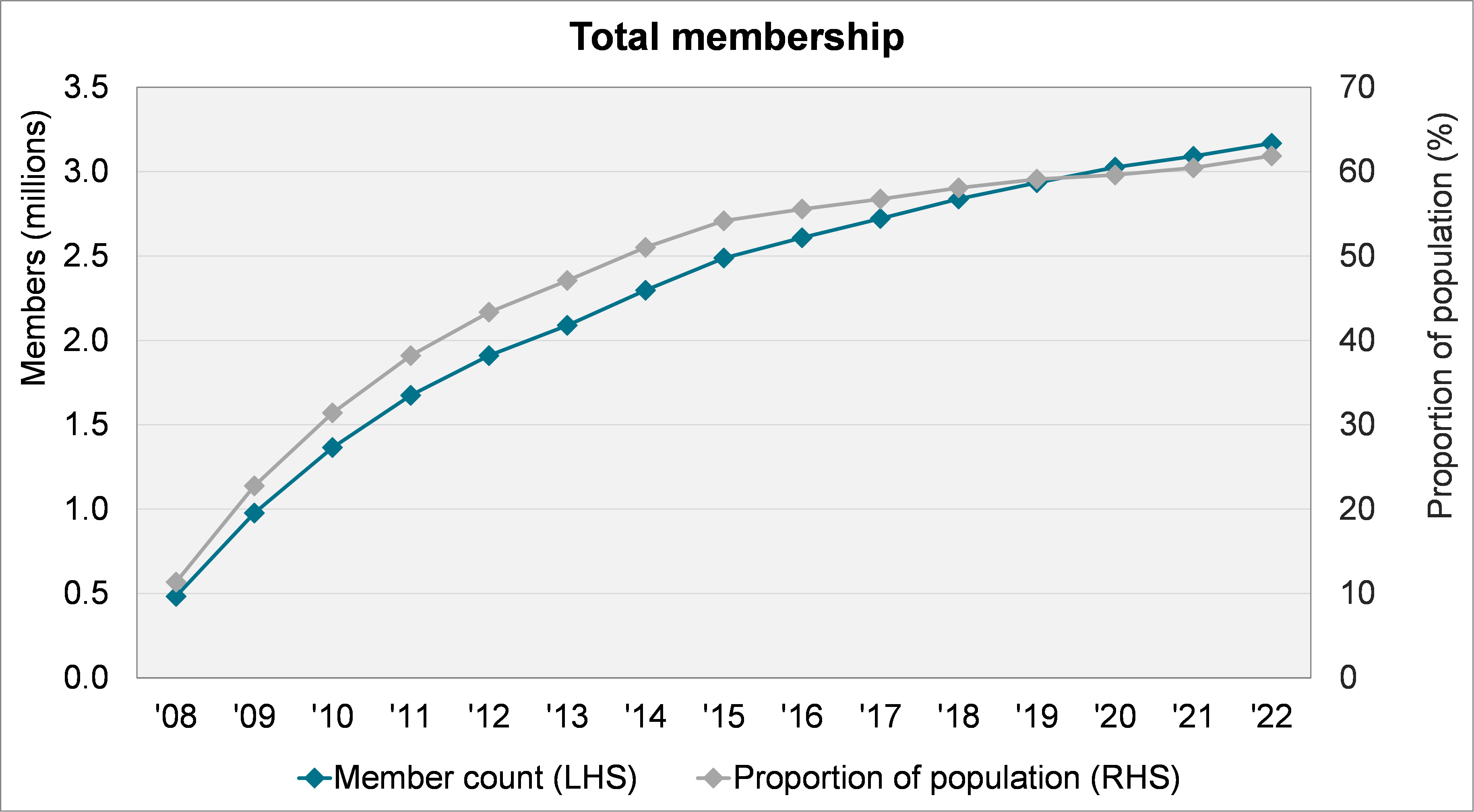
The number of members continues to grow, and in recent years has approximated a linear trend. The change over the last year was a gain of 77,000 members, as shown in the following chart.
Unlike the similar asset growth chart, this chart is unaffected by changes in the value of investments, instead correlating more closely with people entering the workforce. Both 2021 and 2022 have been below the level of previous years, perhaps due to New Zealand’s borders being closed for much of those periods.
Average member balance
Like total assets in the system, the average member balance continues to rise. As of 31 March 2022, the average KiwiSaver member had $28,300 in their account.
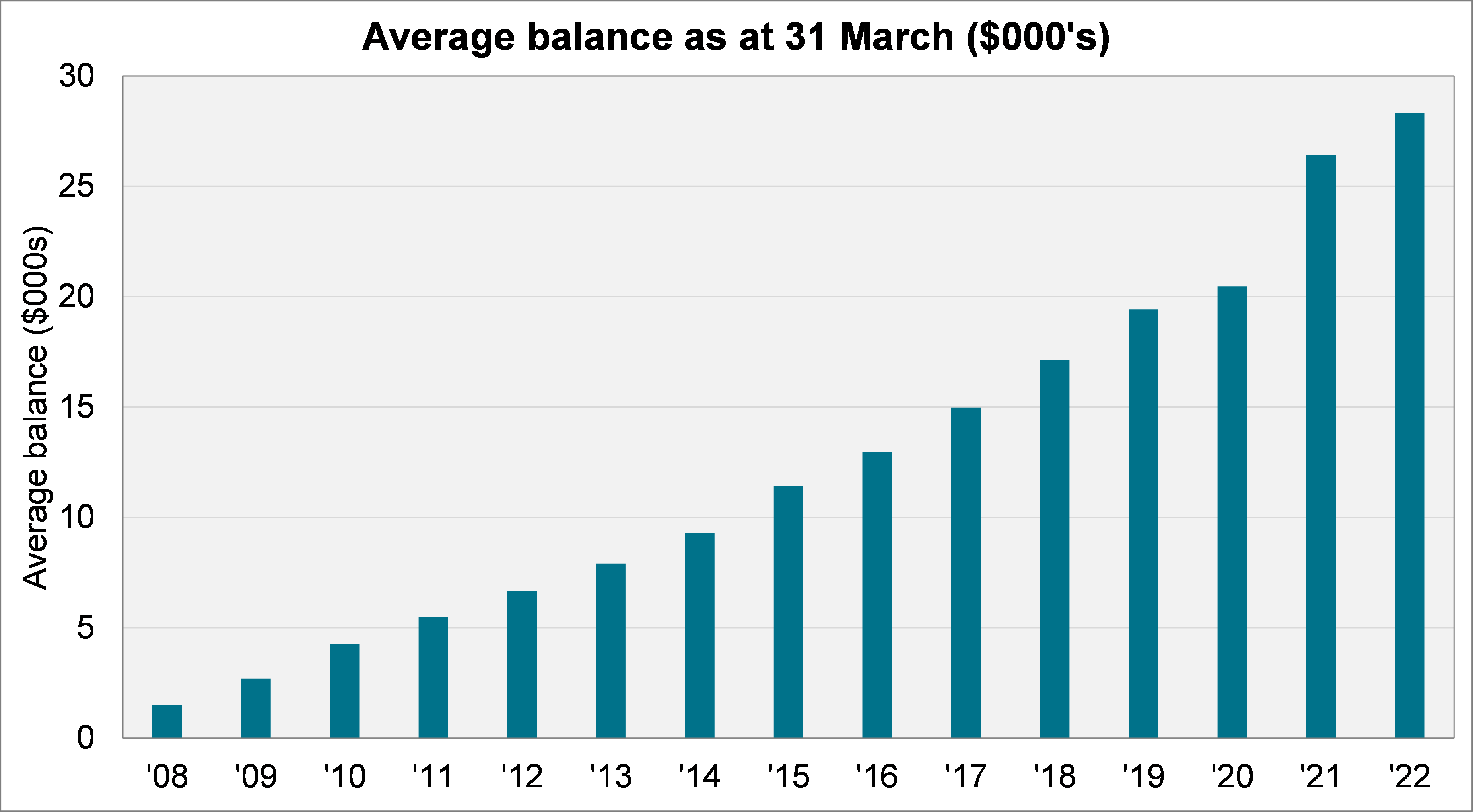
This has not been without volatility, of course. Our study of KiwiSaver demographics found the average balance as at 31 December 2021 – a mere three months earlier than this report – was $29,000. That is, despite ongoing contributions, the average balance had gone backwards 2.5% in the first three months of calendar year 2022.
Financial markets have continued to tumble since 31 March 2022, so it remains to be seen whether the figures charted above can continue to rise.
Contribution rates
The following chart shows the contribution ratio. That is, the proportion of members who made some contribution over the financial year.
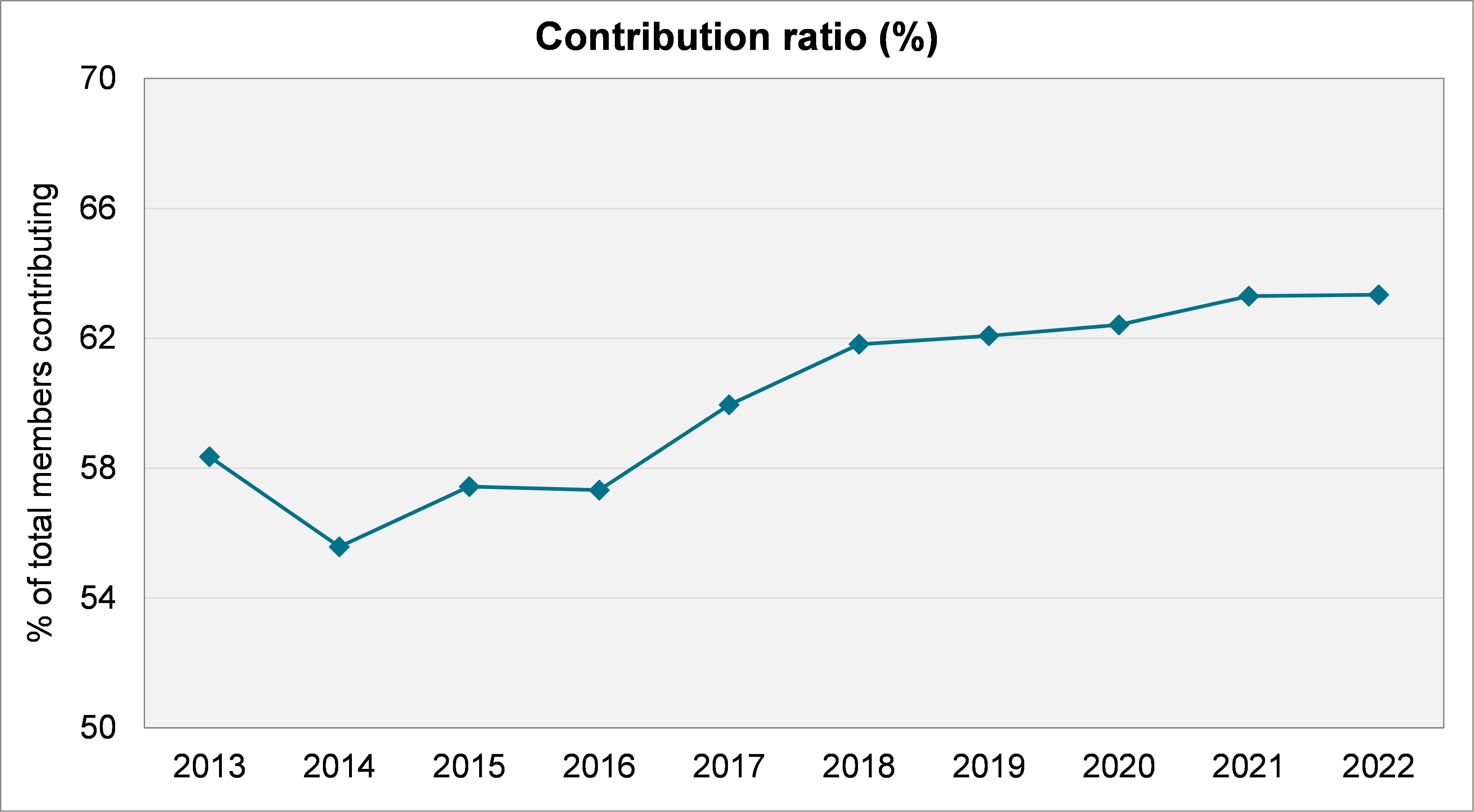
While the contribution ratio has climbed somewhat over the last decade, there remains a high proportion not contributing on a regular basis (about 37%). Moreover, captured above would be those members just making a single contribution of $1,042.86 each year to qualify for the Government contribution of $521.43.
Additionally, as indicated by the relatively low average member balance, it is likely that the minimum contribution rate of 3% is often selected (and that many members are taking advantage of the first home withdrawal option or have taken savings suspensions).
Employers match the first 3% of an employee’s contributions, or between 1.8% and 2.7% after ESCT. For someone earning the average salary, the after tax employer contribution rate is 2.1% and the Government contribution works out to be about 0.7%.
In aggregate, then, the contribution rate for KiwiSaver equates to perhaps 5% to 6% after tax for many New Zealanders. In contrast, the superannuation contribution rate in Australia is currently 8.9% (after tax), set to rise to 10.2% by 2025.
Default members
The next chart shows the breakdown of membership between “default” members and “active” members. The former group has not made any active decision and are therefore invested in a default fund through a default provider.
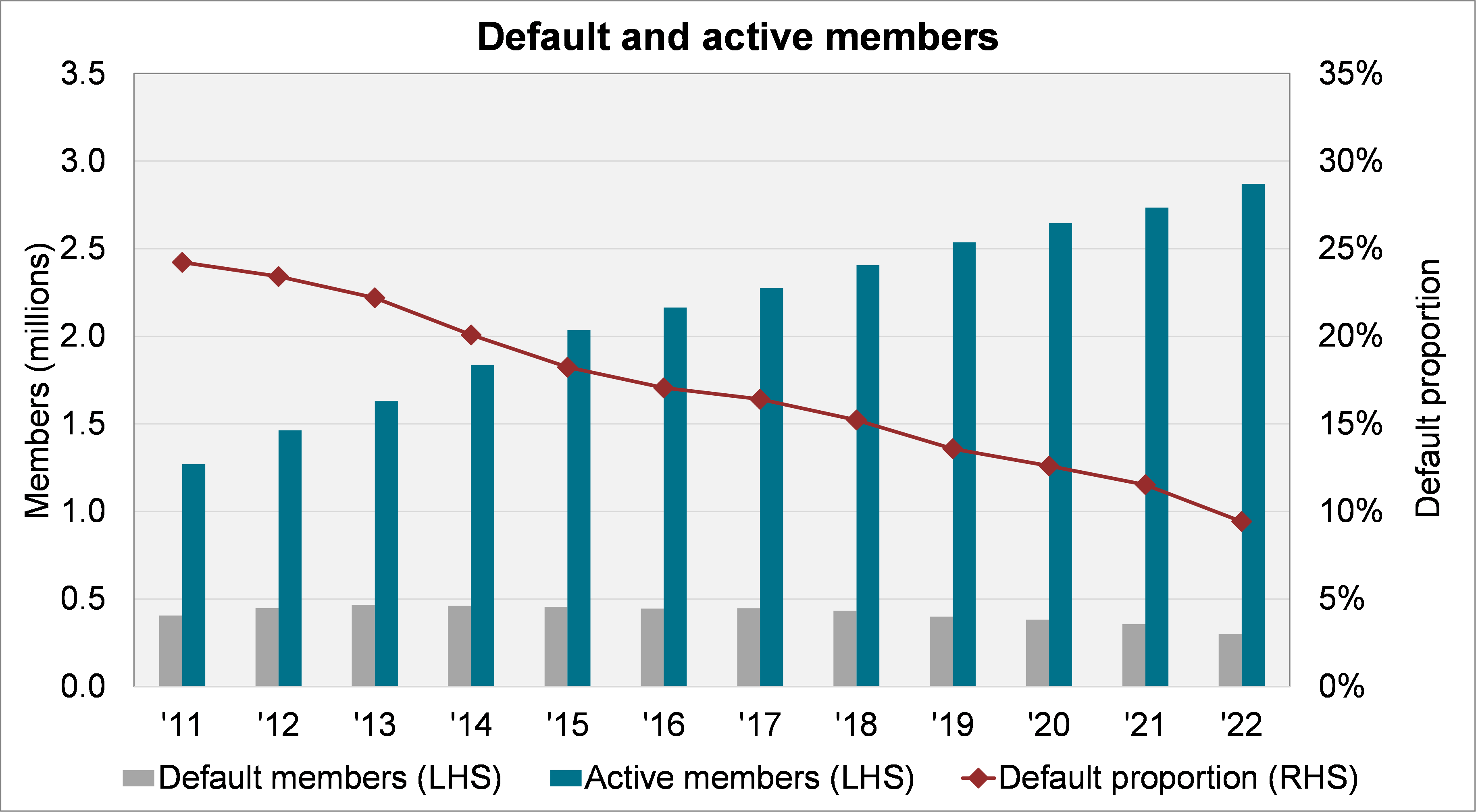
The number of default members fell from 356,000 to 298,000 over the year, the biggest reduction on record. This may reflect campaigns by the outgoing default providers to contact and convert their default members to active members.
As at 31 March 2022, less than 10% of members were classified as default. This is down from almost one in four in 2011.
Default providers
From 1 December 2021, the default provider cohort changed, as shown in the following table.
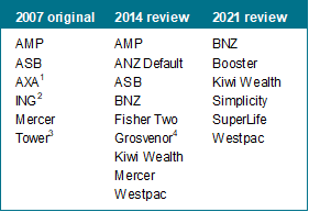
The following charts show how dramatic the change was. Large providers (such as AMP and ASB) lost default provider status, while the relatively small Simplicity and SuperLife were appointed. This means that the default provider cohort is now a minority of the assets in the system.
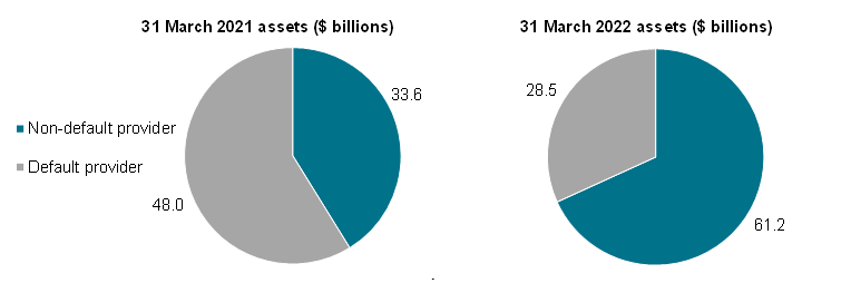
Default providers now account for $28.5 billion. However, not all the default providers’ assets relate to default members. The following charts show that the amount in default funds is much smaller. (Note that both charts are as at 31 March 2022.)
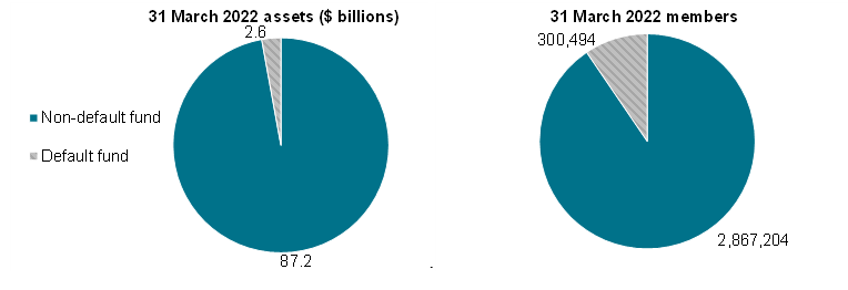
It is interesting that there are 300,000 members in default funds, but only 298,000 default members. That is, some 2,000 members appear to have actively opted into these low cost balanced funds.
Assets
The following table shows each provider’s assets and asset growth over the last year, ranked. The top five in each category are shown as bold text, the top two are shaded.
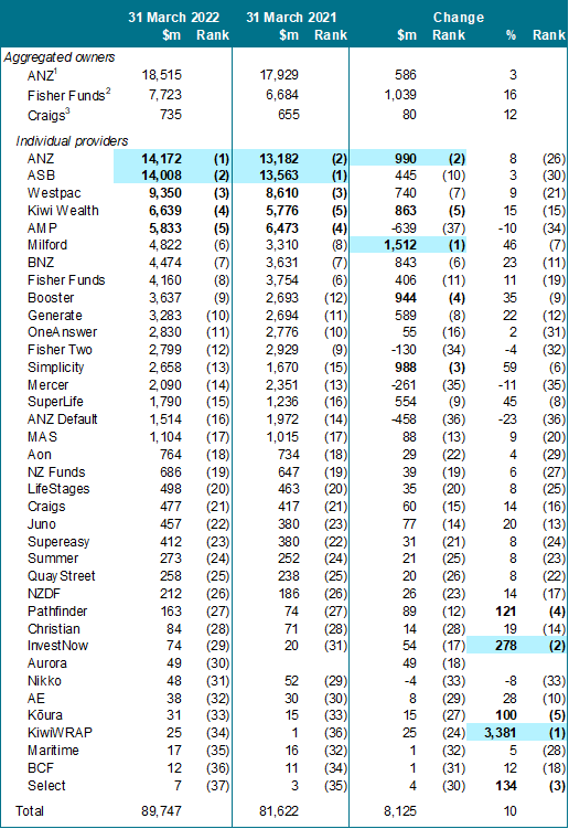
1 ANZ, OneAnswer and ANZ Default.
2 Fisher Funds, Fisher Funds Two and, in 2022, Aon.
3 Craigs and QuayStreet.
This year, the ANZ KiwiSaver Scheme overtook ASB to become the single largest scheme. It grew almost $1 billion over the year, although this was partially offset by losses in the ANZ Default KiwiSaver Scheme. Overall, ANZ added $586 million to reach $18.5 billion across its three schemes.
In terms of asset growth, Milford stands out with a gain of $1.5 billion. It moved up two spots in the rankings, trading places with Fisher Funds.
In aggregate, Fisher Funds accounts for $7.7 billion, having taken over the Aon KiwiSaver Scheme which added about $760 million to its total. In August 2022, it was announced that Fisher Funds would purchase Kiwi Wealth. The addition of this scheme will almost double Fisher Funds’ KiwiSaver assets, bringing it into line with the ASB and ANZ schemes.
Strong growth was also seen by providers retaining or gaining default status. BNZ, Booster, Kiwi Wealth, and Simplicity each saw assets rise $840-990 million. SuperLife and Westpac lagged a bit with increases of $550 million and $740 million respectively. However, in the case of SuperLife, this represented a significant 45% growth in its asset base.
The percentage growth figures are skewed towards smaller providers coming off low bases. The one new entrant this year, Aurora, hit almost $50 million from a standing start – an impressive result. (The previous best effort was Juno which had reached $34 million by its first reporting date.)
Growth in assets under management
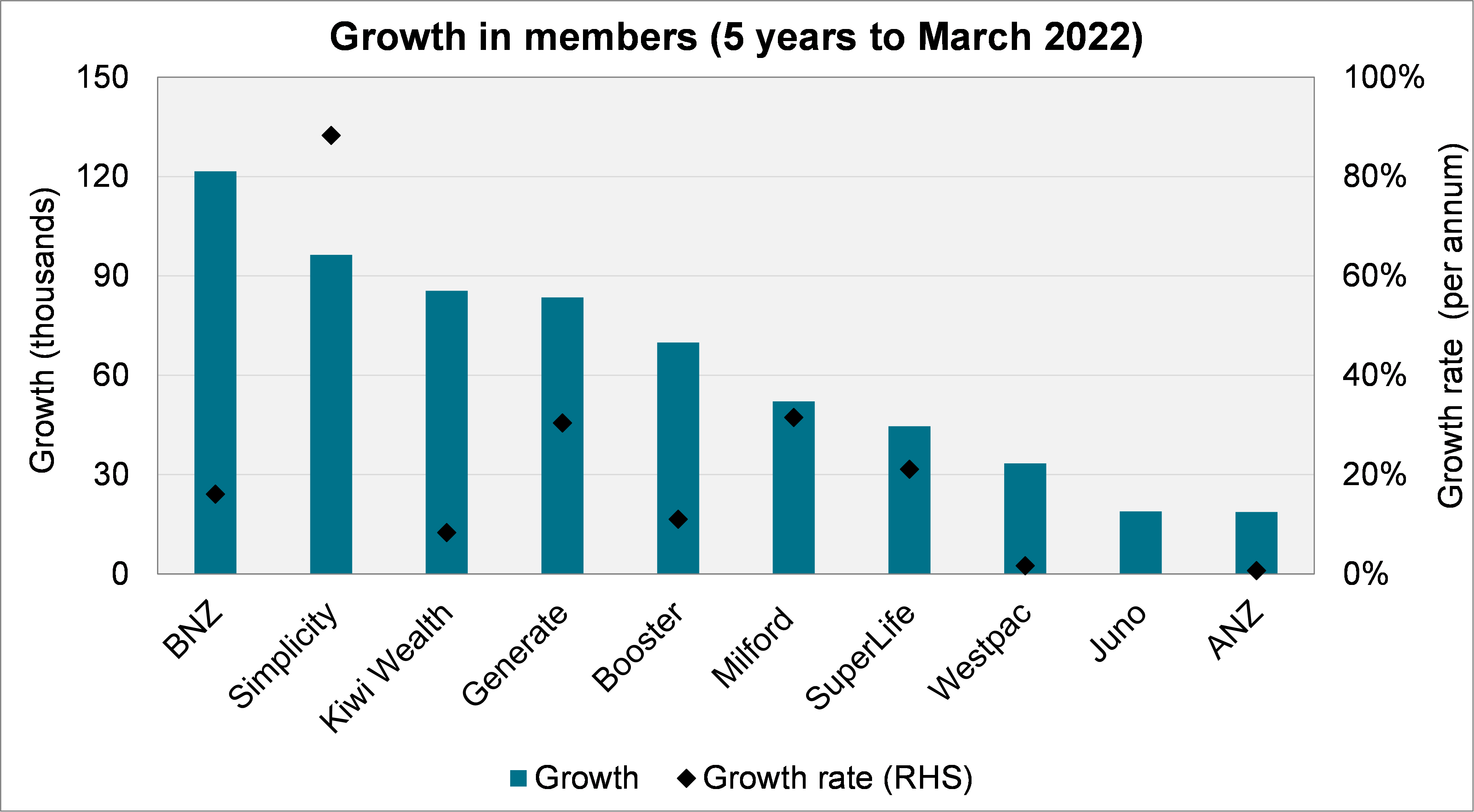
The following chart shows the ten providers with the highest growth in the last five years. The black diamonds give the growth rates measured on the right-hand side.
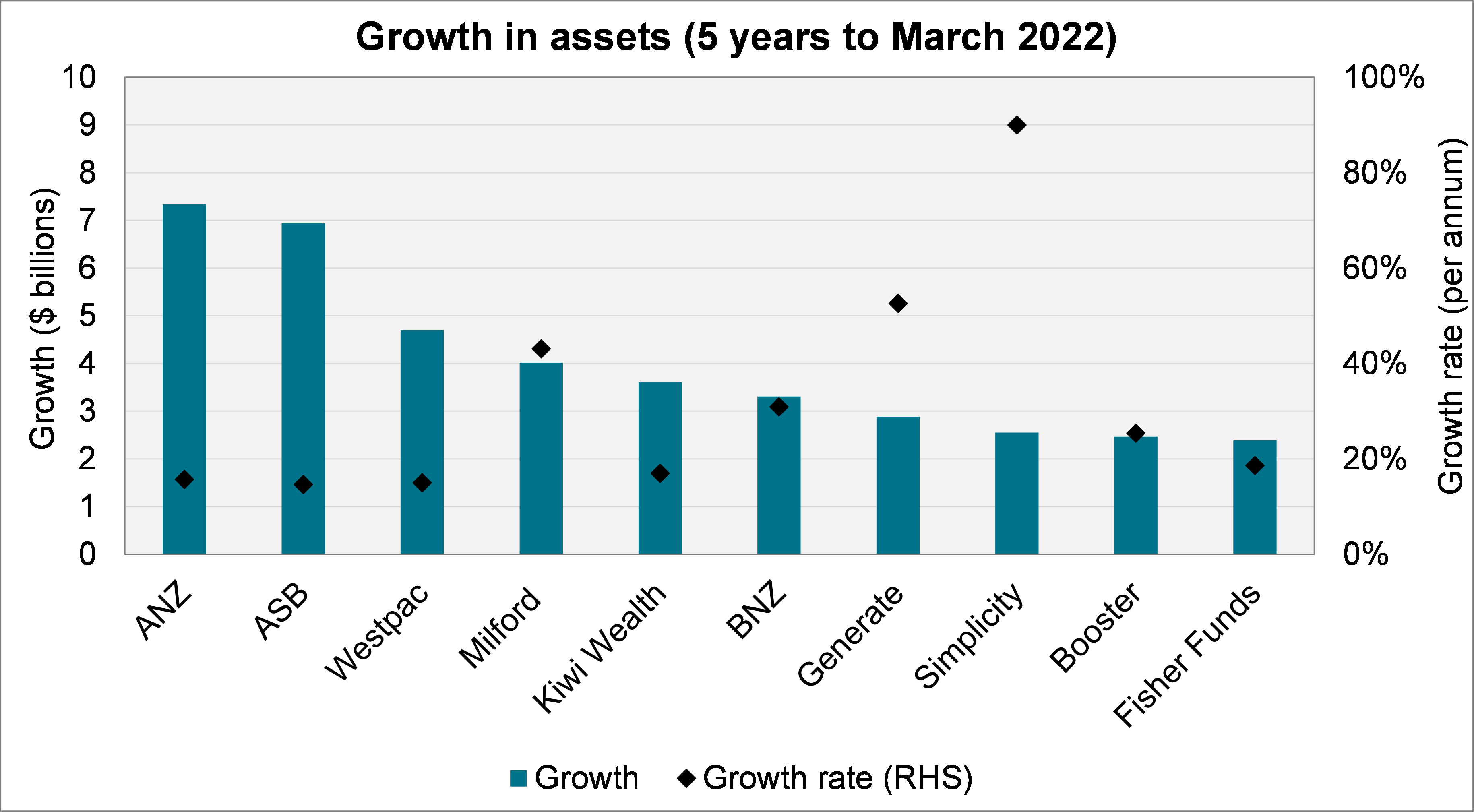
The largest providers – ANZ, ASB, and Westpac – have seen the greatest growth in assets, each at a rate of around 15% per annum. By contrast, Milford has added around $4 billion but at a more considerable 40% per annum. Generate and Simplicity have similarly high growth rates of 53% and 90% per annum respectively.
Other default providers – Kiwi Wealth, BNZ, Booster – also feature in the top ten, although SuperLife missed out (it was 12th, behind AMP).
Fisher Funds rounds out the top ten with a gain of $2.4 billion in its primary KiwiSaver scheme over the five year period. (In addition, the Fisher Funds Two Scheme added $1.1 billion.)
Membership
The following table shows each provider’s members and membership growth over the last year, ranked. The top five in each category are shown as bold text, the top two are shaded.
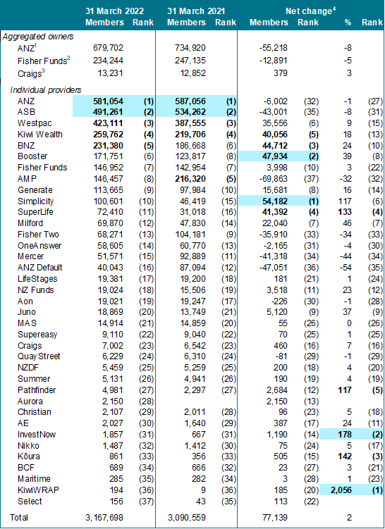
1 ANZ, OneAnswer and ANZ Default.
2 Fisher Funds, Fisher Funds Two and, in 2022, Aon.
3 Craigs and QuayStreet.
4 Net change is the change in the total membership figure year on year. That is, it comprises joining members, less exiting members.
Unsurprisingly, the biggest gains came from the six default providers. These six saw their membership numbers rise by between 35,600 (Westpac) and 54,200 (Simplicity). SuperLife added 41,400 members, more than doubling its membership.
The outgoing default schemes saw the biggest drops. However, Fisher Funds’ acquisition of the Aon KiwiSaver Scheme gave it 19,000 members – partially offsetting the loss of 35,900 members from the Fisher Funds Two KiwiSaver Scheme.
Ranked seventh and eighth, Milford and Generate added 22,000 and 15,700 members respectively. Next was Juno with 5,100 more members; a growth rate of 37%.
Membership growth
The following chart shows the ten providers with the highest growth in the last five years. The black diamonds give the growth rates.[1]
All six default providers are in the top ten – no doubt helped by the redistribution of members in late 2021. Of the six, Simplicity stands out with a growth rate of 96% per annum (Simplicity launched in 2016 and as of 31 March 2017, when this calculation begins, it had only 4,251 members).
Westpac and ANZ feature in the top ten, possibly due to being large banks. However, both have growth rates of only about 2% per annum.
Generate and Milford are notable success stories outside of the default (or previously default) providers, adding 84,000 and 52,000 members respectively. Juno, too, features with a gain of 19,000 members, after launching in August 2018.
Notable funds missing from the top ten were Fisher Funds (11th), NZ Funds (12th) and Pathfinder (13th).
Membership profile
The following charts show the size of the average member’s account and the contribution ratio. We show the top ten and bottom five providers for each.
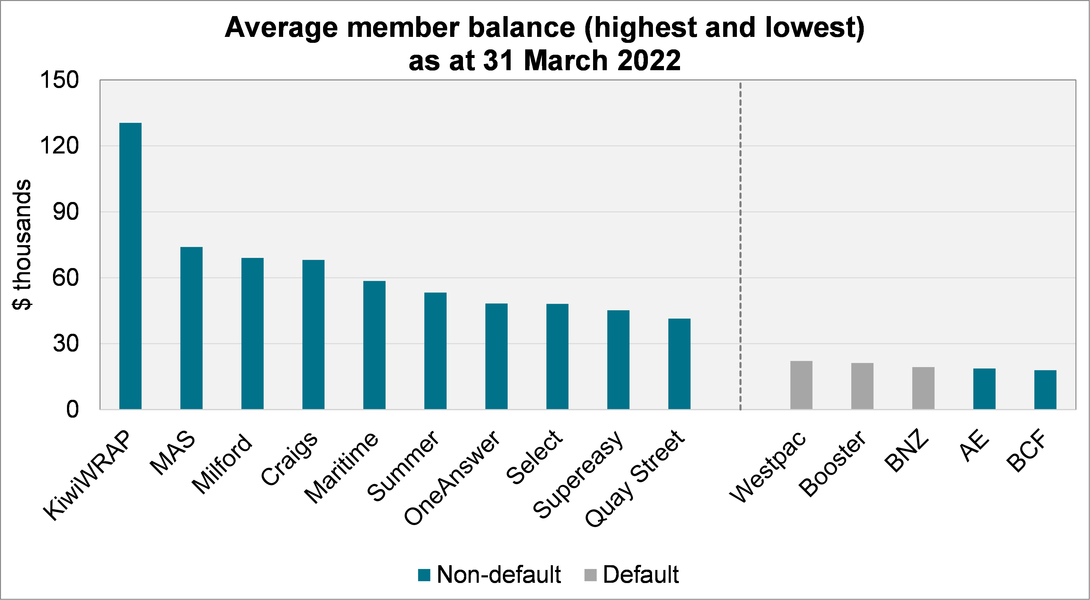
KiwiWRAP stands out, although at just under 200 members it is one of the smaller providers. Default providers tend to have smaller average member balances. Indeed, the average balance of members in the default funds is even lower – around $8,500.
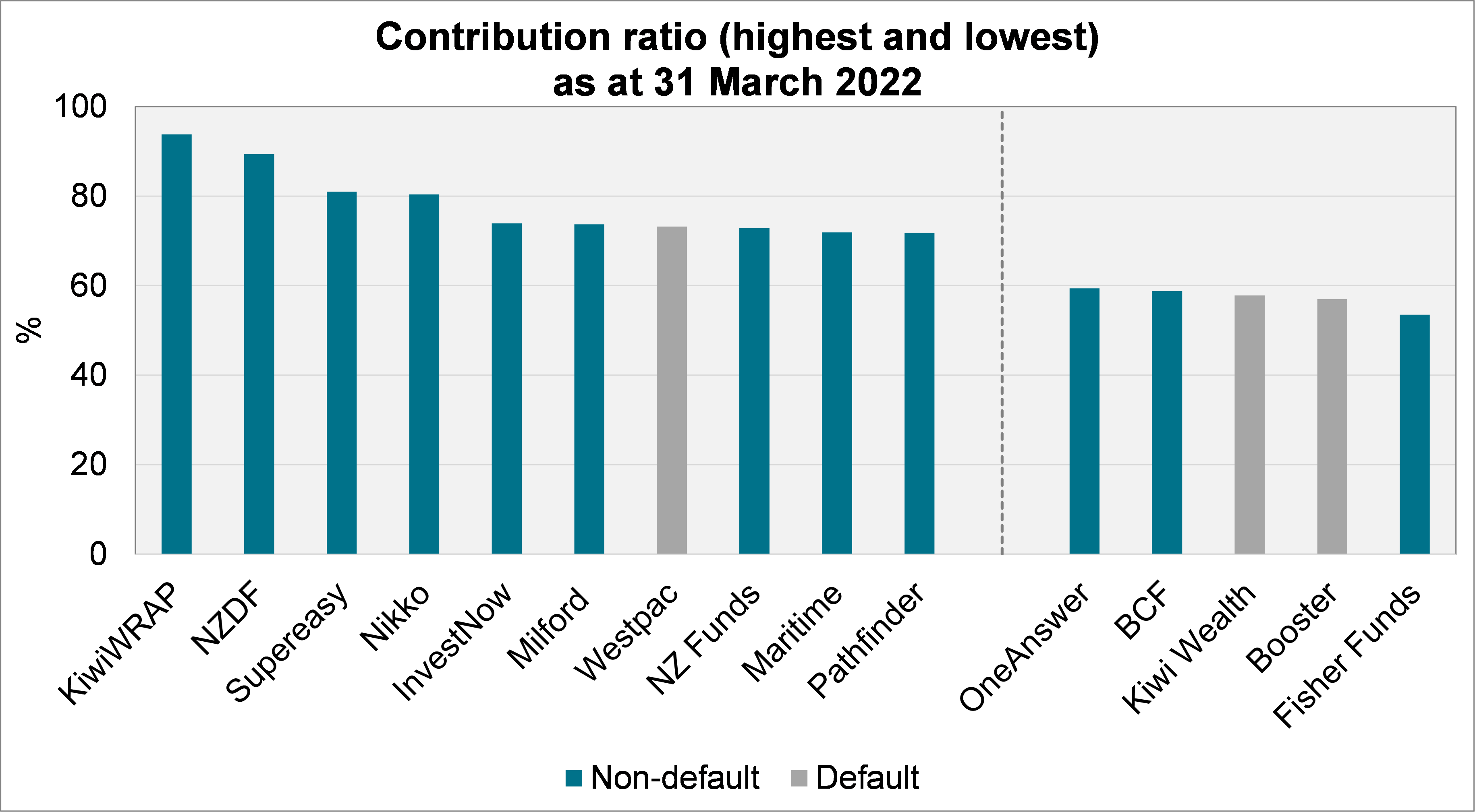
There is some overlap of the providers with high contribution ratios and those with the high average member balances – especially for restricted schemes (e.g. Maritime, Supereasy). This perhaps reflects good engagement with the segment of the population that these providers target.
[1] Juno has existed for less than five years and therefore there is no growth rate charted.
Fees and Expenses
Introduction
In this section, we have gathered fees and expenses from financial statements (but excluded brokerage, which is not always disclosed and, by market convention, is usually omitted in these discussions).
Caution needs to be applied here because the fees disclosed in the financial statements may not tell the full story. For example, there may be fees implicit within the investment products in use. There may also be commission or fee-rebating arrangements.
Overall, because brokerage is excluded and some providers do not disclose fees in the underlying investment vehicles, the figures in this section at least partially understate the overall costs in the KiwiSaver system. Investors should consult Product Disclosure Statements and Fund Updates for detail on specific products or providers.
Total fees and expenses
We begin by showing the progression in total fees and expenses over time.
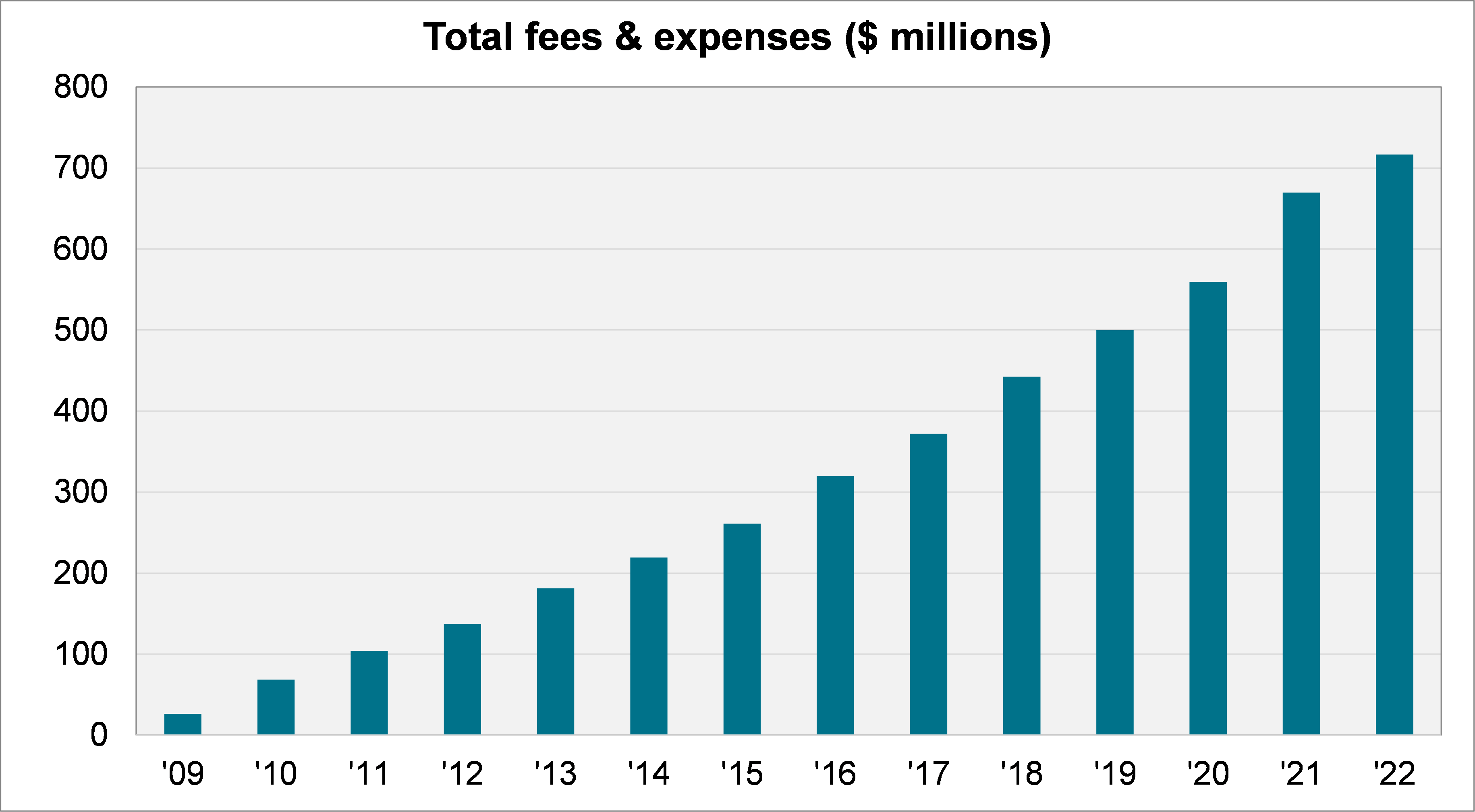
Since a large component of fees is usually determined by a rate applied to a member’s balance, these figures rise over time in line with the assets in the system.
The total fees and expenses in the KiwiSaver system passed $700 million this year.
Fees and expenses per member
Dividing the total fees and expenses by the average number of members gives us the average per member.
Note that where membership has changed significantly over the year this calculation can be distorted – especially when the change did not occur evenly over the year. This is potentially an issue this year because there was a large reallocation of default members.
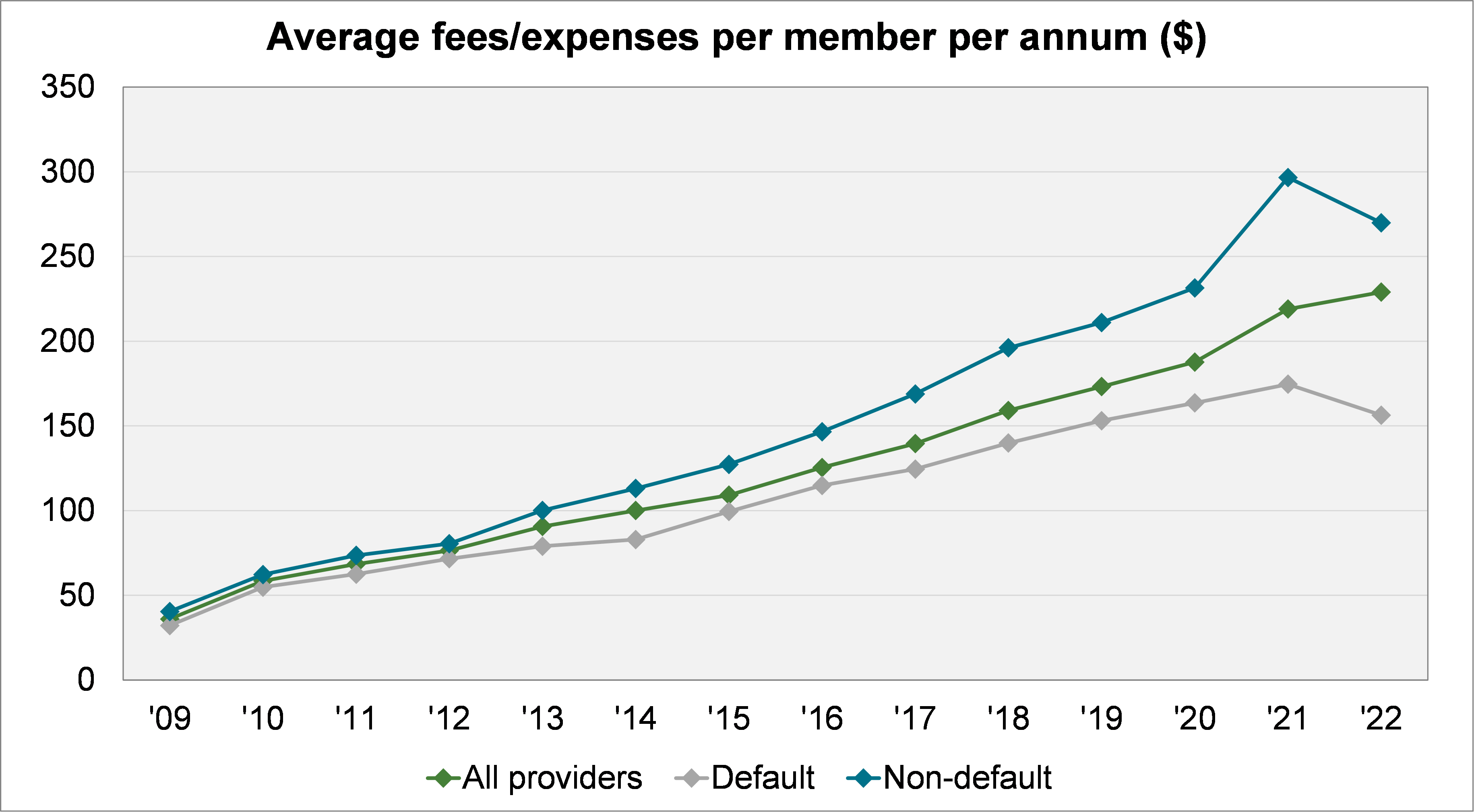
This measure tracks upward over time as members’ balances have grown. In 2022, the average member paid $229 in fees and expenses.
It is interesting to note the difference between the default and non-default providers. The default providers have, on average, $157 in fees and expenses per member, while non-default providers are $270. (Note that not all members within a default provider’s scheme are default members.)
Fee and expense rates
We next move to considering fees and expenses as a percentage of assets. This is the typical way that fees are expressed. The following chart shows how this has changed over time.
Again, because the percentage is calculated by dividing total fees and expenses by average assets, there is a degree of distortion where assets have changed significantly throughout the year.
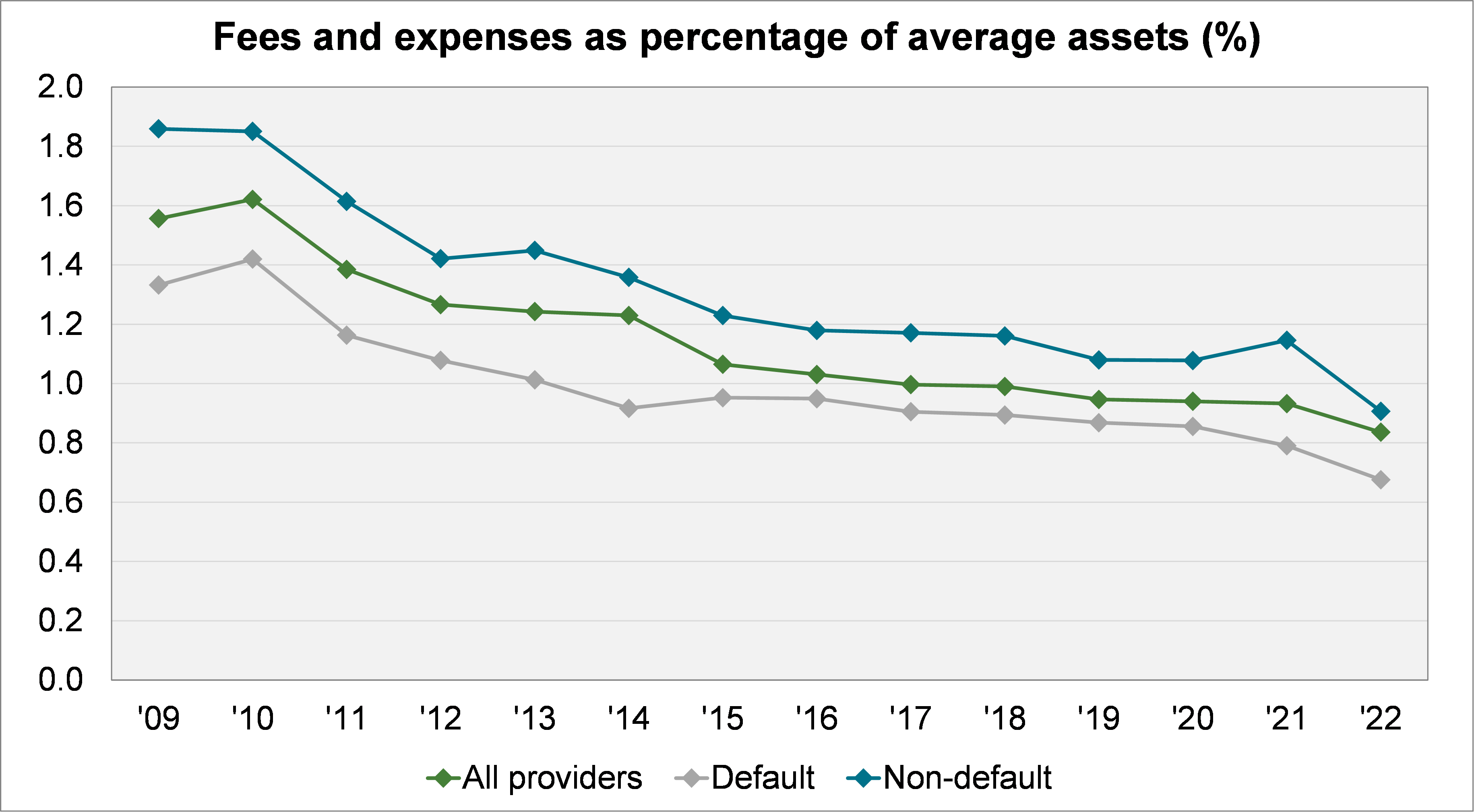
When we consider all providers in aggregate, there has been a significant downward trend over time. In 2009, the average fee and expense rate was 1.56%. Today it is 0.84%.
Default providers are even lower on average – just 0.68% in 2022.
Performance
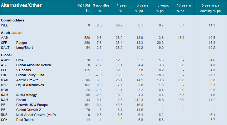
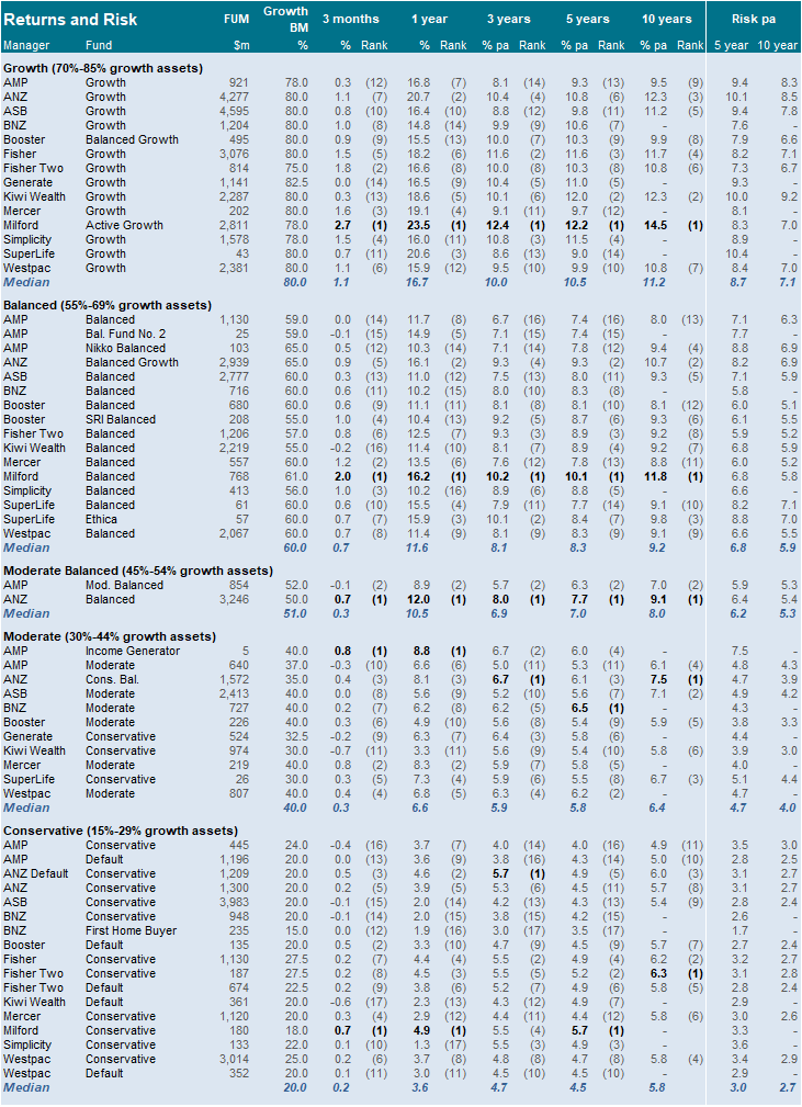
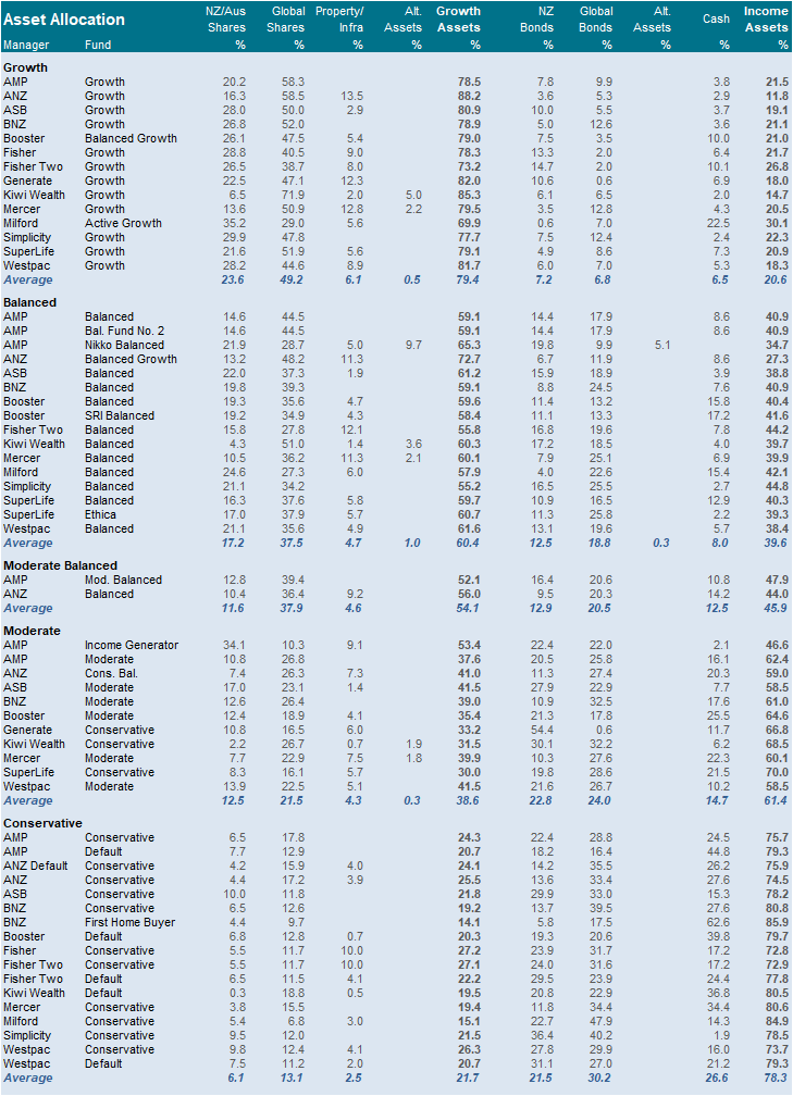
Due to the large amount of different investment funds across many providers, the analysis has been limited to largest sixteen providers. Between them, these providers accounted for $84 billion, or 94% of the entire system.
We have not shown all the funds available from each provider. Instead, we show the flagship diversified funds, categorised based on the funds’ strategic weighting to growth assets.[2]
- Growth: 66-85% growth assets.
- Balanced: 50-65% growth assets.
- Moderate: 30-49% growth assets.
- Conservative: 15-29% growth assets.
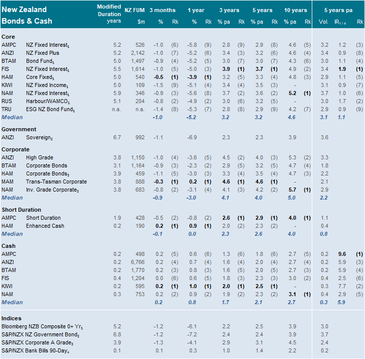
Performance is shown after deductions for fund charges but before tax. Full details of this survey universe are included in Appendix B.
We show the data in a “risk return” chart for the ten years ended 31 March 2022. This chart shows the trade-off between return (vertical axis) and volatility (horizontal axis). Volatility is a measure of how much the value of the investments fluctuate.
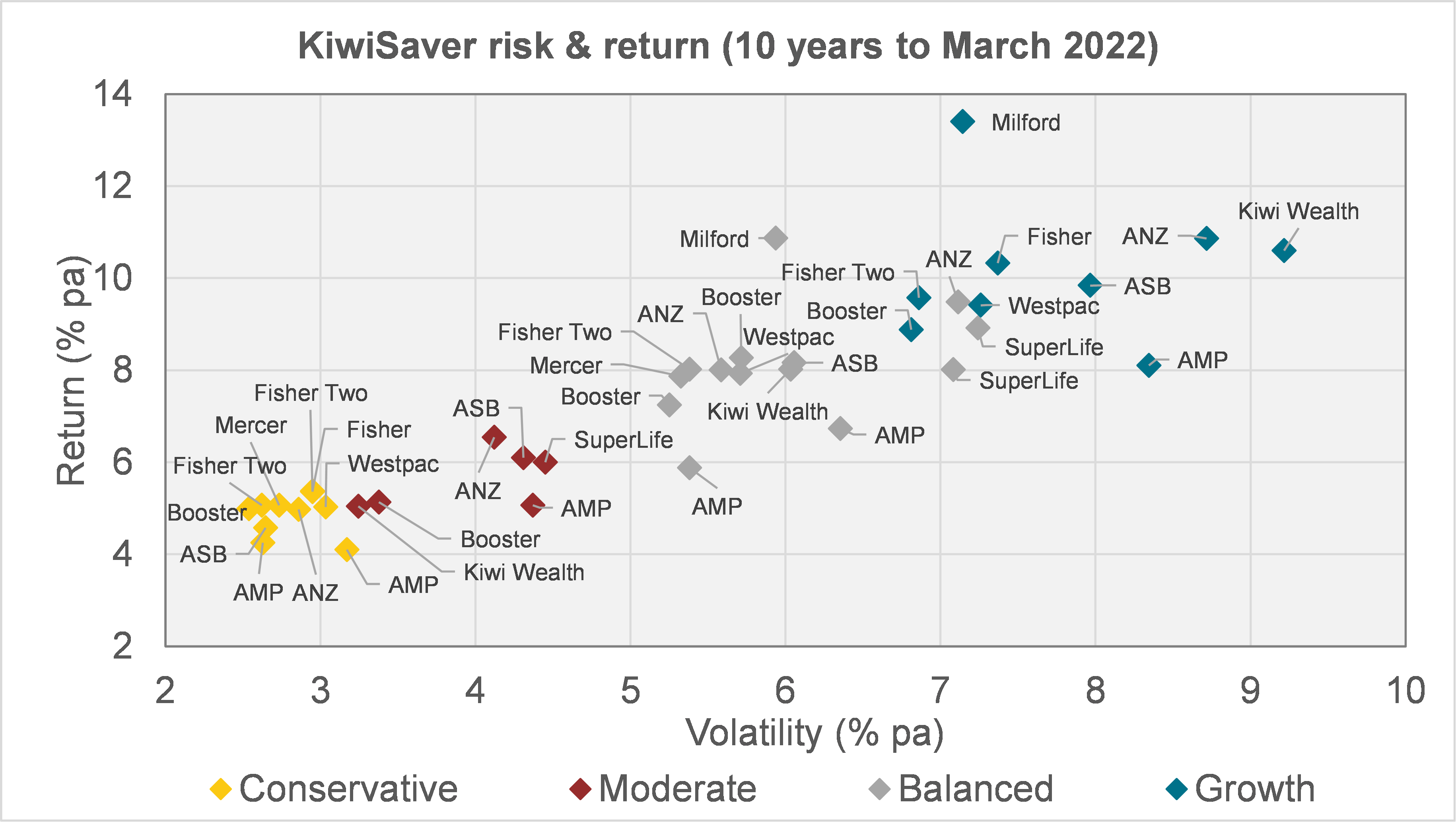
As one would expect, there is a positive relationship between risk and return. Conservative funds have been more stable, but have realised lower returns.
The best returning fund in this group has been Milford’s growth fund. In fact, Milford’s balanced fund has outperformed most other large providers’ growth funds over this period.
[2] These accord with the groupings used in our quarterly investment survey, and differ slightly from the FMA’s guidance on this matter.
https://www.fma.govt.nz/assets/Guidance/Guidance-note-on-risk-indicators-and-description-of-managed-funds.pdf
Competitiveness
Introduction
In this section, we examine competitiveness. We begin by simply charting the number of providers.
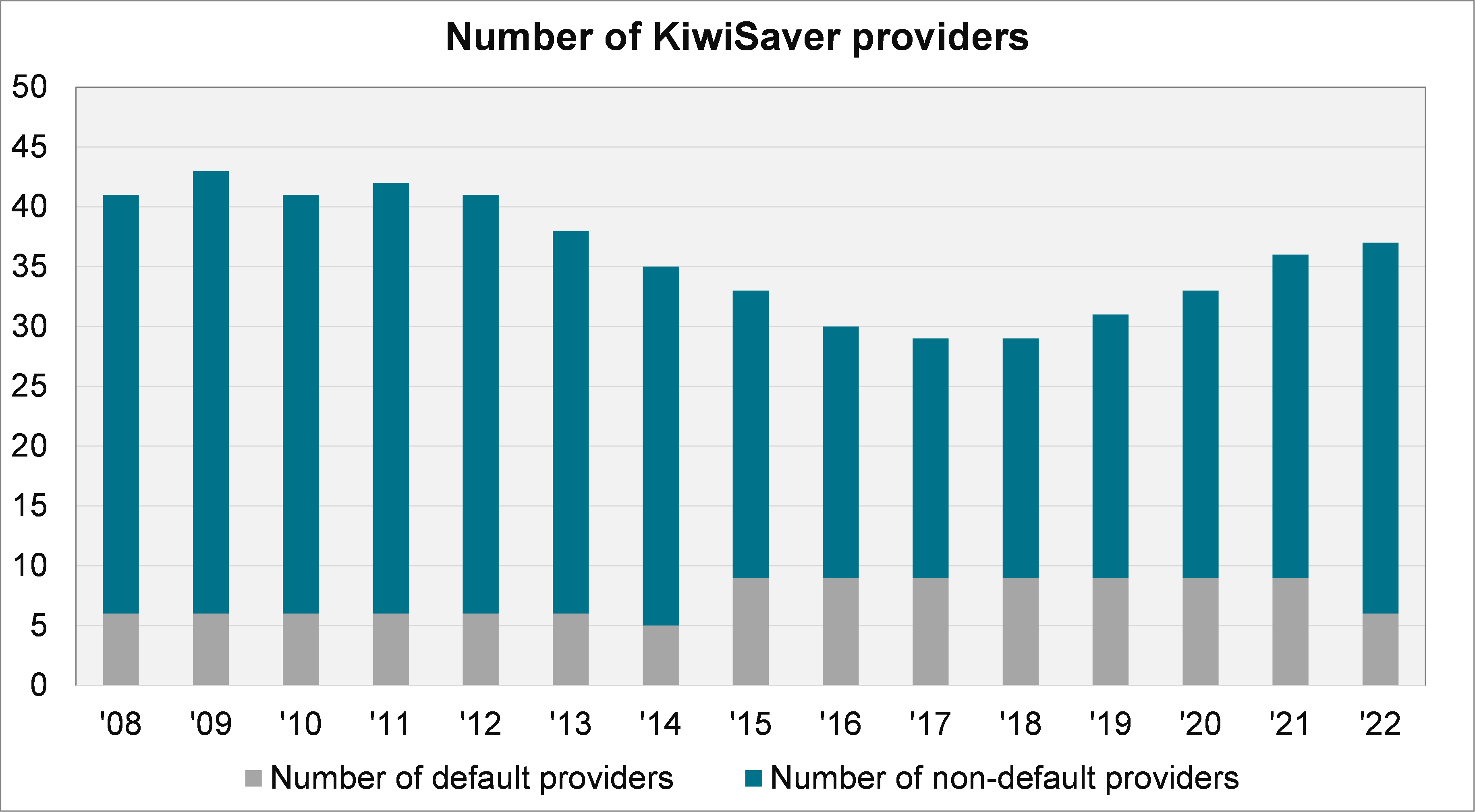
This shows that, following a period of consolidation, the number of options available to consumers has expanded. In the year to 31 March 2022, one more scheme launched (Aurora), taking the total to 37. Since then, the Kernel Wealth KiwiSaver Scheme has launched.
Herfindahl-Hirschman Index
A formal measure of competitiveness is the Herfindahl-Hirschman Index (HHI). The HHI is a score which ranges up to a maximum of 10,000, which would indicate a monopoly. It is defined as the sum of the squares of market shares. For example, a market with two participants, each with 50% market share, would have a HHI of 5,000 (being 502 + 502). If the second participant split into two, the HHI would drop to 3,750 (being 502 + 252 + 252).
The US Department of Justice and the Federal Trade Commission have given the following descriptors in general:[3]
- Unconcentrated markets: HHI below 1,000.
- Moderately concentrated markets: HHI between 1,000 and 1,800.
- Highly concentrated markets: HHI above 1,800.
To relate this to New Zealand, Productivity Commission data showed that as at 2016:[4]
- “Rail, Water, Air and Other Transport” had a HHI of 2,169 (a highly concentrated market).
- “Telecommunications, Internet and Library Services” had a HHI 1,612 (a moderately concentrated market).
- “Financial and Insurance Services” had a HHI of 713 (an unconcentrated market).
We have calculated the HHI for KiwiSaver on three different metrics: the proportion of assets, members and fees/expenses. This is shown, over time, in the following chart.
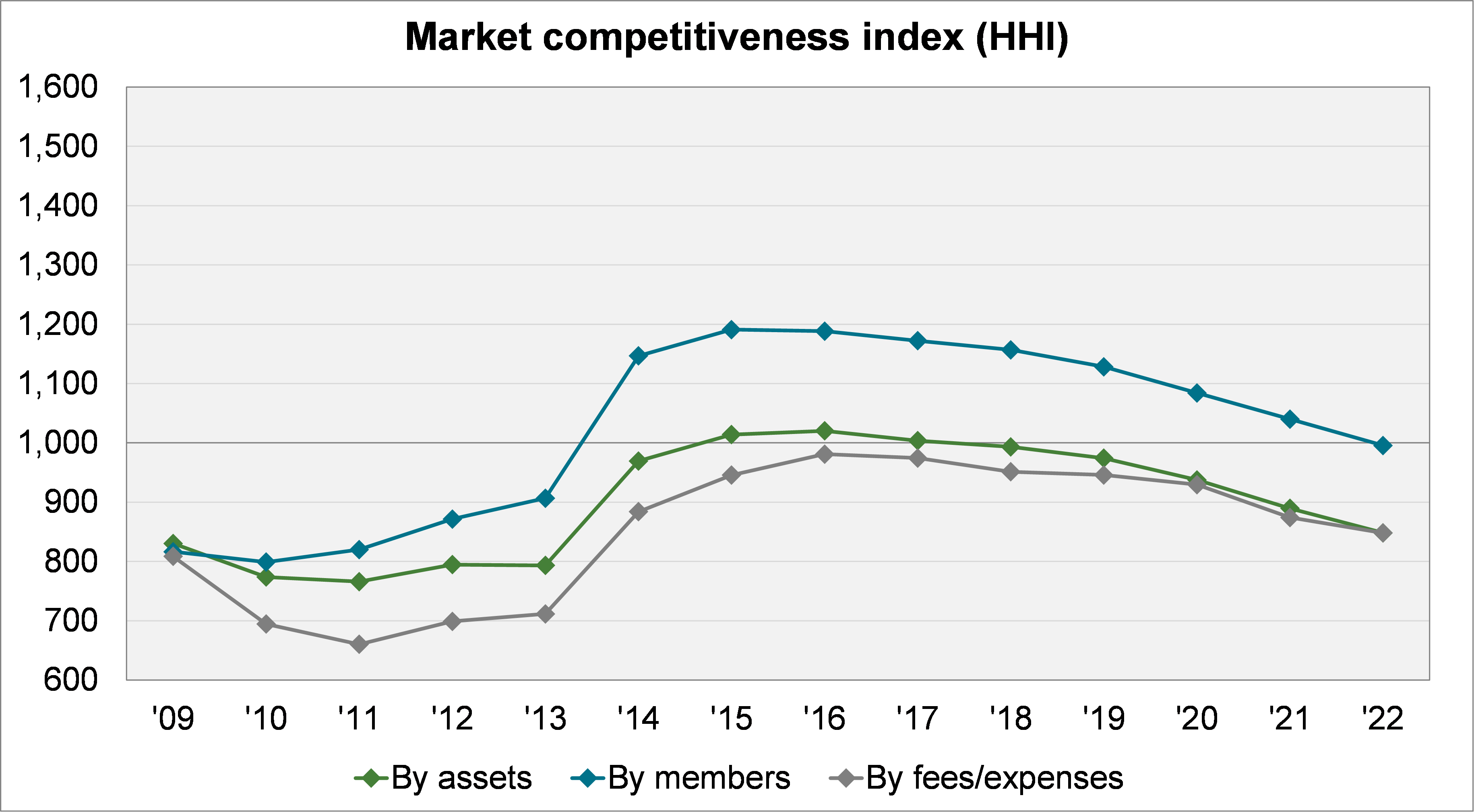
As of 31 March 2022, KiwiSaver appears “unconcentrated”, with all figures below the critical 1,000 level (the membership HHI is 996). However, if we consider KiwiSaver on the basis of combined ownership (e.g., combining Fisher Funds and Fisher Funds Two), it is a different picture.
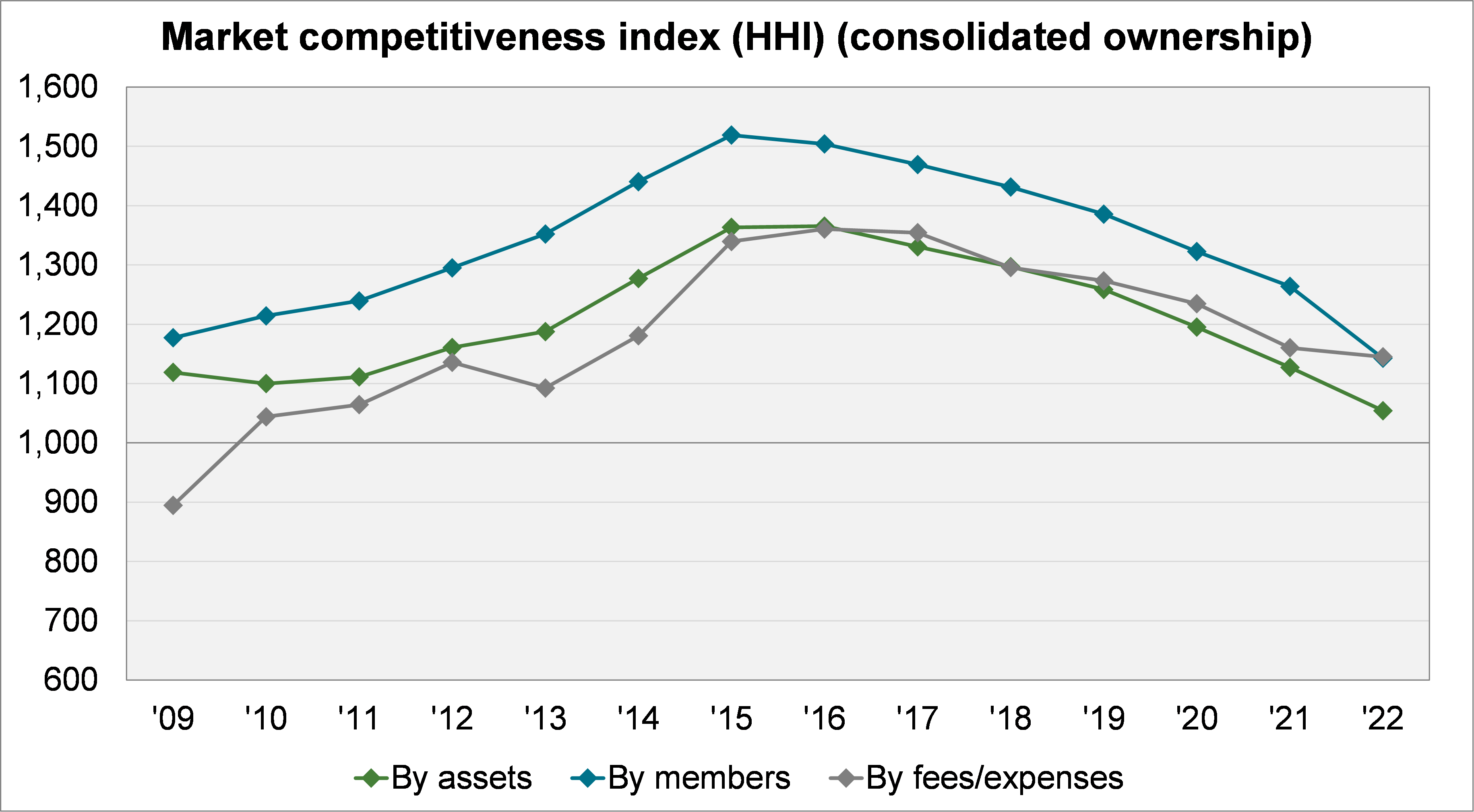
On this basis, the industry looks “moderately concentrated”. The membership HHI, in particular, peaked at 1,500 in 2015.
However, the trend downwards is also evident here. All three measures are closing in on the 1,000 level. Additionally, in the last year the membership HHI has fallen significantly – partially driven by the reallocation of default members.
Default provider share
Finally, we consider default providers’ market share. (This considers default providers’ total assets and membership; not just default members.)
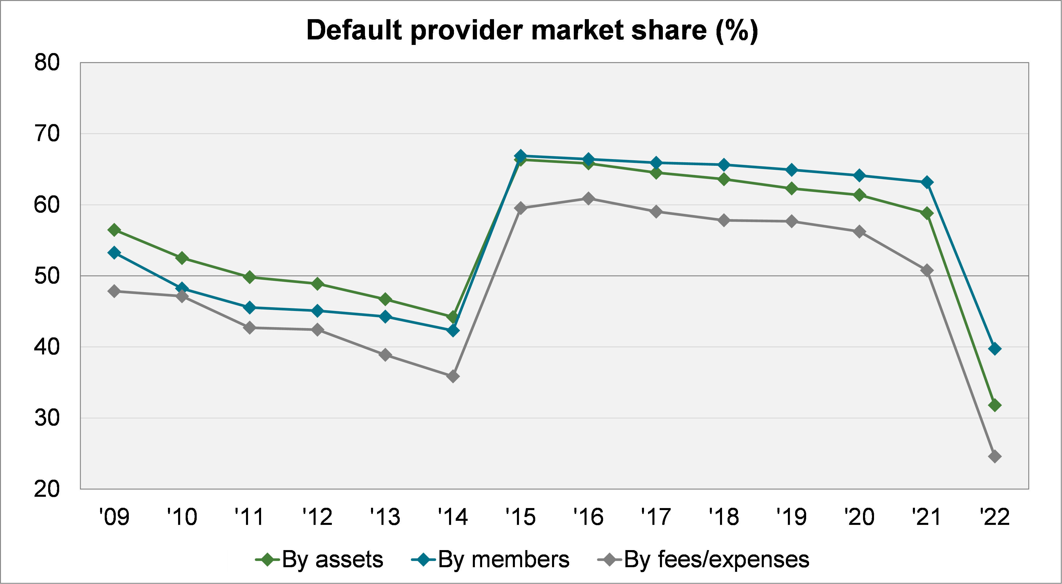
Default providers had held the majority of assets and members since 2015. However, following the reallocation in the 2021 review, the share of all three measures has dropped to its lowest level on record.
[3] https://www.justice.gov/atr/horizontal-merger-guidelines-0
[4] https://www.productivity.govt.nz/competition_explorer/
Appendices
The appendices are available in the PDF format of the report, available here.